The second picture does seem to show the front vertical edges are rounded a bit? The corners only need a small radius, 4% of the width, like 3", to get smooth flow.
Looks like it could use some rounding on the top though.
Something like this:

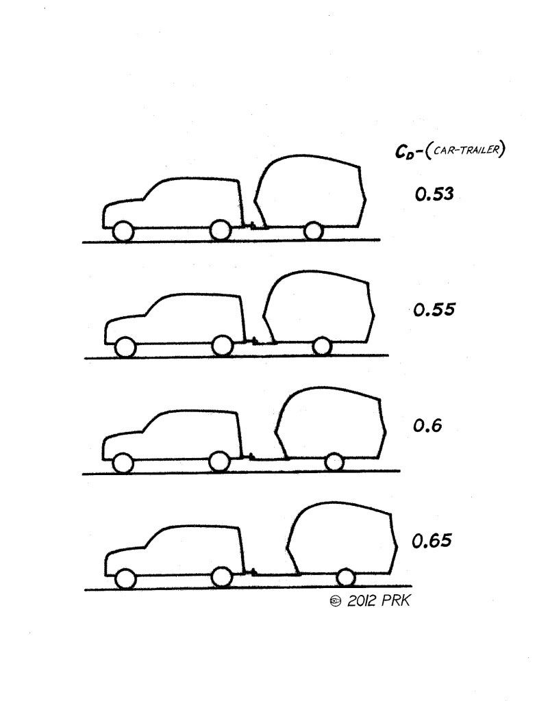
Is shrinking the gap something you'd consider? Shortening the tongue might make it harder to maneuver, but might help. Phil has posted some graphics about the gap distance.
Found one:
