Tesla model 3 interior, looks like a sci fi movie.
Hate that it has no actual buttons.
Everything goes via the touch screen.
Anyone who knows anything remotely of cars, knows how hard it is to operate a touch screen while driving.
Roads in the majority of the world are horrible and full of potholes.
It would work well perhaps for a nicely paved track, but not for the streets.

Meanwhile the interior of the Nissan Leaf:

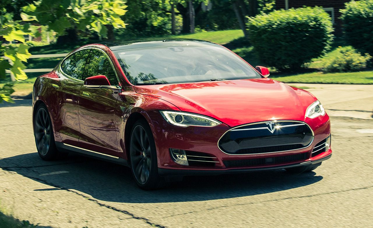
The Model 3 side shot, looks lots better than their predecessors, and better than the leaf. The leaf looks like an economy car, the Tesla like a sports car.

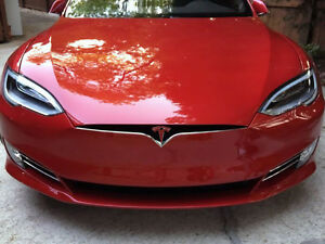
but you can't deny that not a lot of people are turned on by the front.
There's something terribly missing:

Like a grill.
Though newer models address this:

A lot has changed, but so did it with the first Volts.
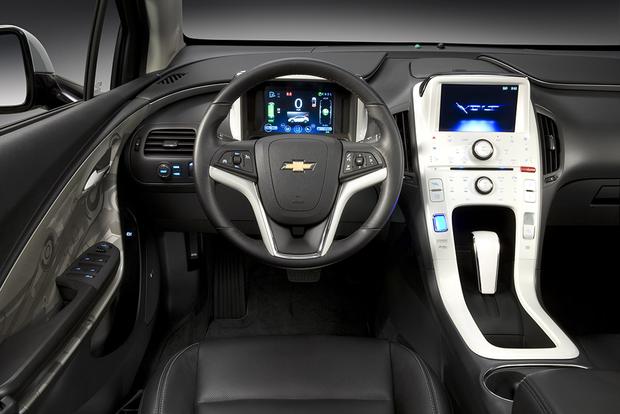
I abhorred the Volt when it first came out with it's center handbrake like gearstick, and cockpit design was so ugly:

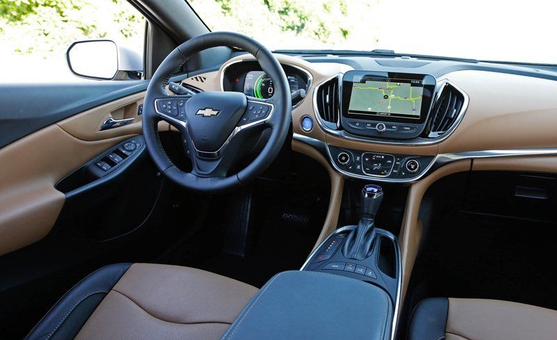
Over time these things got addressed to look almost like a regular car:

I'm still not sold on a tesla though (or any electric for what it's worth).
Economically, it makes no sense for me to buy one, until they are able to defy the laws of physics, and make it charge twice as fast on a 120V outlet. I don't have 240V outlets where I live, and drive 70 miles a day, for at least 5 days a week.