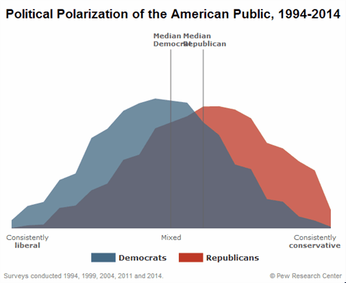
 Animated graph shows how USA has become more polarized in last 20 years
It's still two-dimensional. Overlay two curves and it's better. Animate and it's better.
Compare to your Honda Civic's injector mapping. 
__________________
.
.Without freedom of speech we wouldn't know who all the idiots are. -- anonymous poster
____________________
.
.What the headline giveth, the last paragraph taketh away. -- Scott Ott
|