Hey everyone,
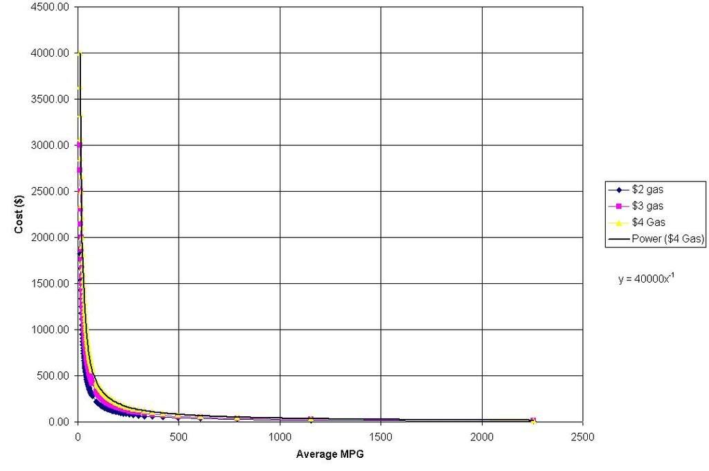
I love working in excel and use it a lot in my research work. While working with excel to calculate the best cars this summer with respect to mpg and cost of gas I came up with an interesting fuel economy graph.

This graph shows the annual cost of a person who drives 10,000 miles a year with respect to their average fuel economy.
now you can see that the fuel economy axis is very expanded, some may think that no car can get that. But those expanded numbers are produced from the fuel economy of the VOLT when driven over its initial 40 mile range.
You can infer a couple things from this graph, one is that I am paying way too much for gas every year. Two that a more efficient car is a great idea to reduce annual monies spent on fuel. But if you go beyond thinking about what this is doing to you think about what this means to oil companies.
Based on this graph the more fuel efficient any one place becomes they will loose sales/profits at a GEOMETRIC rate, which is more abrupt than an exponential rate.
The far end of the graph at 2500 mpg is achieved when you only drive 1 mile over your 40 mile electric range. the limit of the Volts efficiency goes to 55 miles per gallon if running on pure gas engine. But it also shows as the Volts mileage goes to zero (under 40 miles in our case) the fuel economy will go to infinity, and you will pay zero dollars for gas a year. But that also means that it becomes a mileage dependence factor but I wont talk about that.
So in conclusion if all you were looking at was this graph then it would be definitive mathematical proof that oil companies (or any company that has this sales relation) would hate to have something that drastically reduces its sales. This also shows a reason for why gas prices are seeming to go so high so lately, to compensate for more FE vehicles you have to jack up prices A LOT!
But thats enough typing.